Project Summary
While working at Fruition as a UX Designer, I had the opportunity to help build a unique fundraising platform that allowed schools and non-profits to raise money for their causes through brand loyalty.
Role
Sketches, Wireframes, Visual Design, Concepts, Mockups, Design Support
Year
2016
Project Background
KULA Causes was a fundraising platform founded in 2011. Their goal was to revolutionize fundraising by moving away from traditional, outdated forms of fundraising such as chocolate bars, raffle tickets, bake sales and silent auctions.
Instead, KULA allowed supporters of local schools, community groups and causes to donate by making everyday purchases from their favorite brands through KULA’s Shop, Earn and Donate (SED) ecosystem. By allowing loyalty members to seamlessly convert their rewards currency into a donations, KULA inspired consumers to buy from certain brands by leveraging consumer values.
To make their platform a success, the KULA team engaged the team at Fruition to design and build both a responsive, public-facing website powered by WordPress and a feature-rich administrative dashboard powered by Drupal.
Project Deliverables
1. Responsive public-facing brochure website design powered by WordPress.
2. Customer-facing landing page templates for causes, sub-causes and campaigns
3. Administrative dashboard design for administrators, managers and supporters powered by Drupal.
2. Customer-facing landing page templates for causes, sub-causes and campaigns
3. Administrative dashboard design for administrators, managers and supporters powered by Drupal.
My Role
I worked closely with the Creative Director, Lead Developer and project managers, providing sketches, wireframes, concepts, visual designs, mockups and general design support as needed.
Causes, Sub-Causes and Campaigns
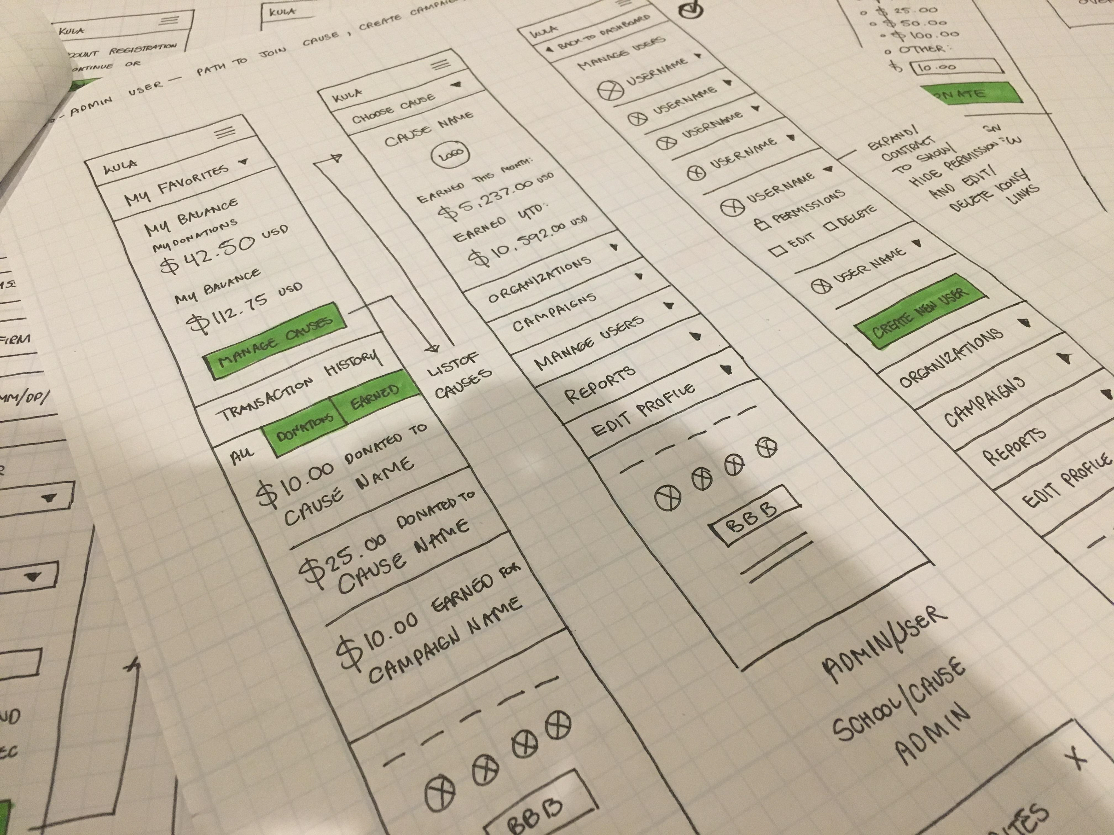
Thumbnail Sketches
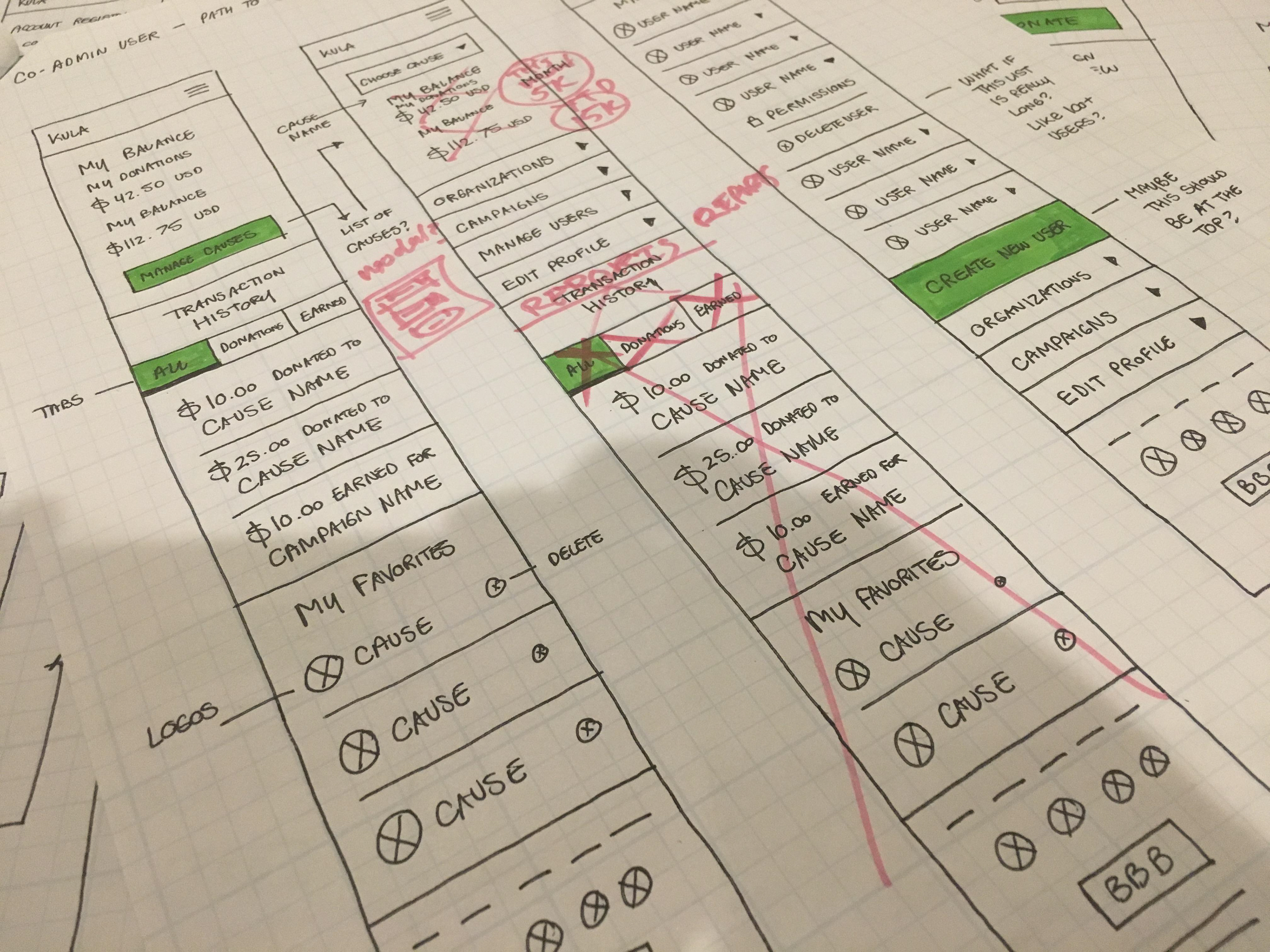
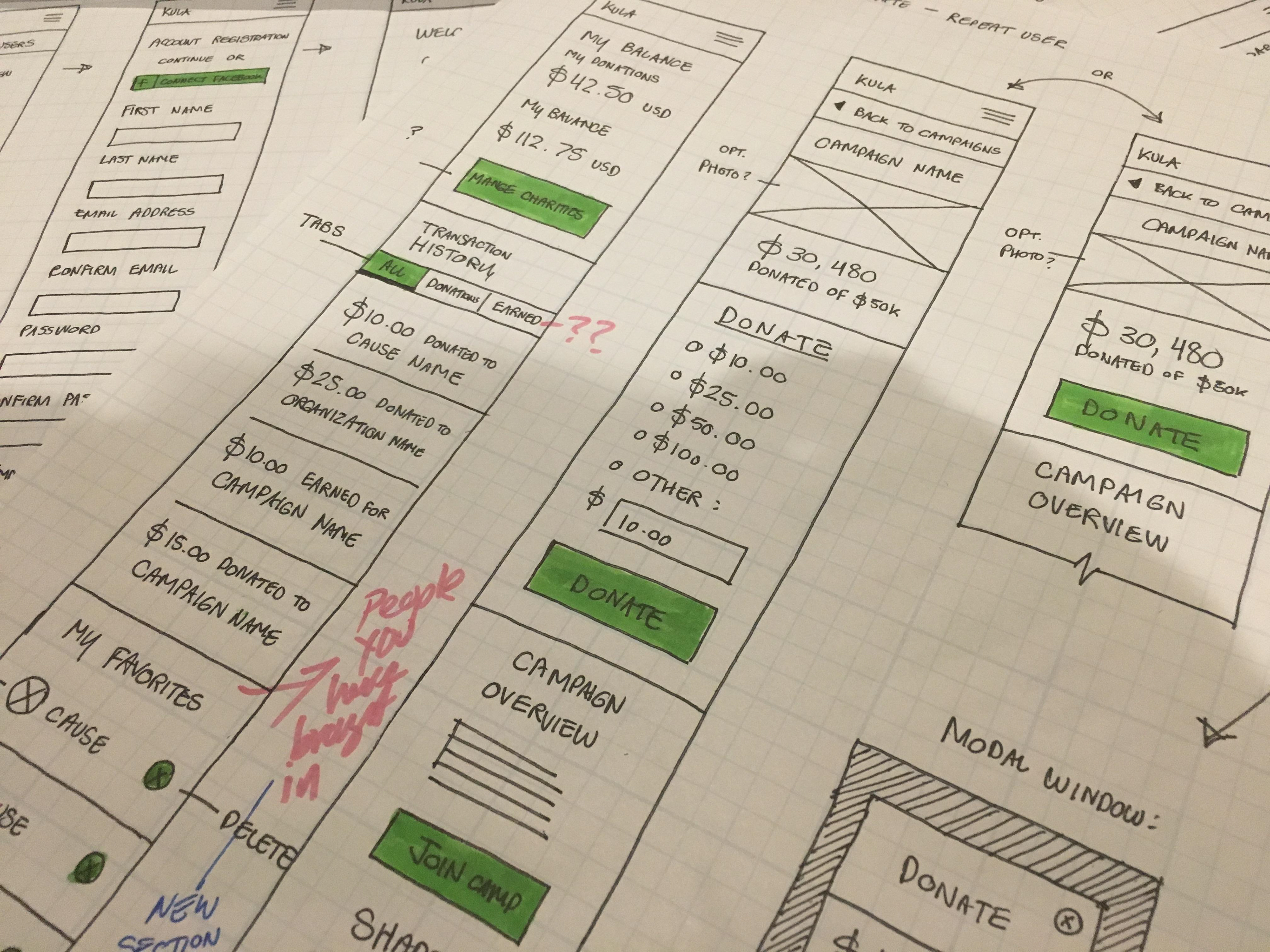
We utilized a mobile-first approach, sketching on lined graph paper. Important calls to action and features were highlighted in green. The Creative Director provided feedback (seen in pink) and minor revisions were made before moving on to wireframes.
Wireframes
Medium fidelity wireframes for both desktop and mobile devices were produced using Axure. We created multiple rounds of wireframes for the cause, sub-cause and campaign page templates, public-facing website and administrative dashboard.
Cause Landing Page Template
Sub-Cause Landing Page Template
Campaign Landing Page Template
Donate Landing Page Template
Visual Design
KULA already had a logo and color palette set in stone so we started there and produced four different visual looks using a campaign page template. I explored a variety of fonts, tab styles, button styles and visual elements. Ultimately, the tabbed navigation at the top of the page was abandoned but the basic framework for the page was carried over to the mockups phase.
Visual Design — Style 1
Visual Design — Style 2
Visual Design — Style 3
Visual Design — Style 4
Mockups
Once the visual design was finalized, we moved on to mockups. Many elements were reused to save time in the development phase. Orange was introduced into the website’s color scheme to draw more attention to important calls to action.
Cause Landing Page Template
Sub-Cause Landing Page Template
Campaign Landing Page Template
Donate Landing Page Template
Administrative Dashboard
Wireframes
The KULA Causes team needed a feature-rich administrative dashboard design that would allow users to view and access balances, transaction histories, earning reports and pending approvals while easily managing causes, campaigns and users. We explored a couple of options for the design—with and without a sidebar navigation menu.
Administrative Dashboard — Option 1
Administrative Dashboard — Option 2
Mockups
After finalizing the wireframes, we applied the chosen visual design style and utilized Highcharts for embedding interactive charts and graphs. The design was also optimized for desktop, tablet and mobile devices.
KULA — Mockup — Administrative Dashboard — Menu Open
KULA — Mockup — Administrative Dashboard — Menu Closed
Optimizing the Mobile Experience
For the mobile experience, we placed key actions and information towards the top of the page for easy access.
Results & Lessons Learned
Results
Unfortunately, KULA Causes came to the end of their journey in 2017. Schools and non-profits using KULA were able to generate close to 5 million dollars in donations.
Interested in hiring me for a project? Get in touch!

