Project Summary
At Fruition, I led a full website redesign for MPulse Software, Inc. Based in Eugene, OR, MPulse is a purveyor of easy-to-use CMMS software, allowing their customers to reduce maintenance expenses, minimize downtime, extend equipment life and boost productivity throughout their organizations.
Role
User Flow Assessment, Competitive Analysis, User Survey, User Personas, Wireframes, Concepts, Mockups, Logo Design
Year
2019
The Problem
MPulse needed a website redesign. But they didn’t want to build another site founded on their blind spots, myths and misconceptions about their customers. They wanted to know exactly who their customers and prospects were and use that information to uncover common pain points and missed opportunities.
Project Goals
• Conduct a user survey and create user personas to fully understand the MPulse audience (current customers and prospects).
• Design an on-brand, modern and responsive B2B website that showcases the power of MPulse’s CMMS software.
• Improve search engine rankings by optimizing the site’s content and information architecture.
• Increase conversions by improving and optimizing the site’s messaging and user journey.
• Design an on-brand, modern and responsive B2B website that showcases the power of MPulse’s CMMS software.
• Improve search engine rankings by optimizing the site’s content and information architecture.
• Increase conversions by improving and optimizing the site’s messaging and user journey.
User Personas
User Survey & Key Takeaways
We utilized a tool called SurveyMonkey to build and send a short user survey to current MPulse Software users. The survey covered demographics, internet activity, job responsibilities (and challenges) and software features. To gain an adequate number of responses, we offered a small incentive. We were able to obtain 427 survey results with a 79% completion rate. Below are just a few of the many takeaways from the survey.About 85% of respondents are between the ages of 35 and 64 and the majority are men
Roughly 45% of respondents work in the manufacturing industry
Biggest noted challenges at work include a lack of communication, equipment failure and time management
Most popular product features include maintenance scheduling and work order, inventory and vendor management
User Persona Worksheets & In-Person Exercise
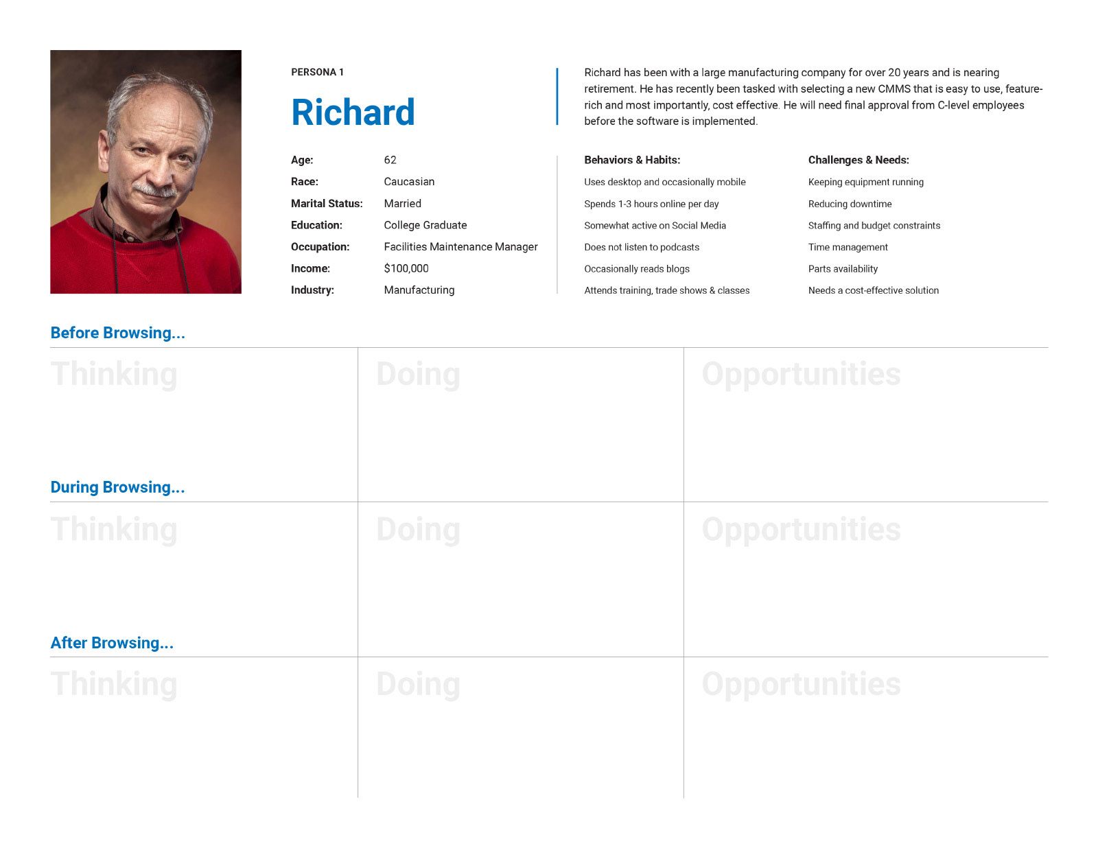
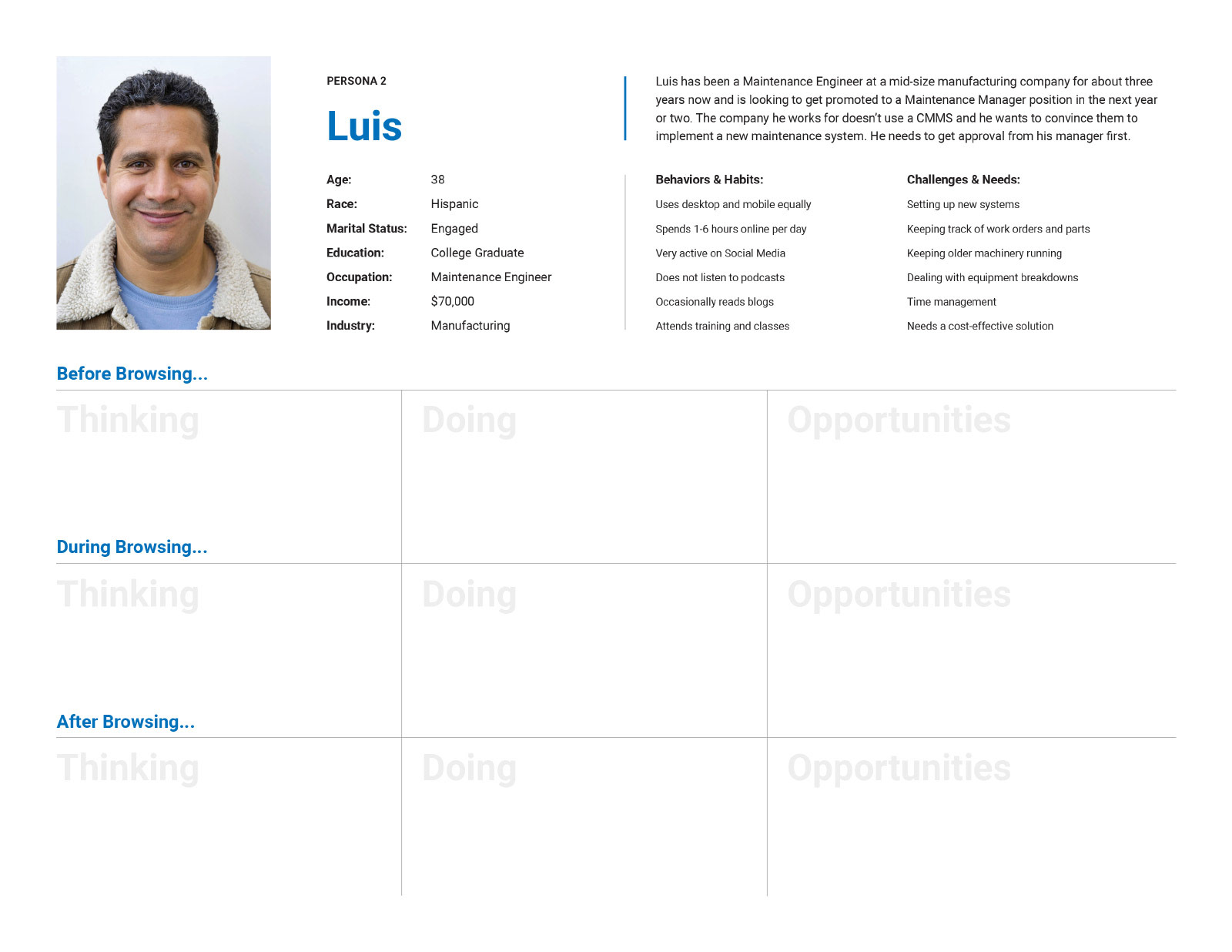
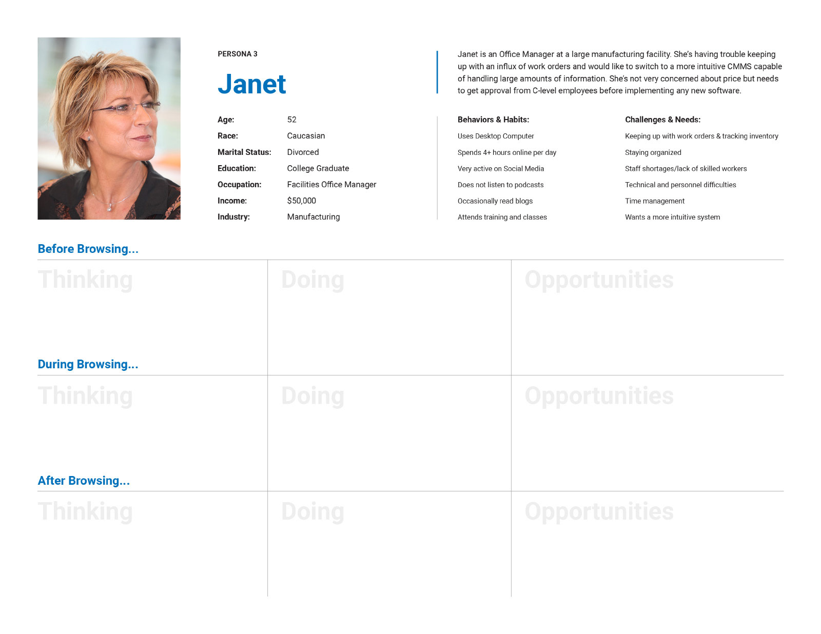
We filtered the SurveyMonkey responses and created three user personas:
Richard, a disengaged Facilities Maintenance Manager who is nearing retirement
Luis, a tech-savvy Maintenance Engineer who is hungry for a promotion
Janet, a middle-aged Facilities Office Manager who is feeling overwhelmed
Luis, a tech-savvy Maintenance Engineer who is hungry for a promotion
Janet, a middle-aged Facilities Office Manager who is feeling overwhelmed
We utilized the survey responses to identify each user’s behaviors and habits and challenges and needs. After crafting each persona, we conducted an in-person exercise with the client where we used our intuition to identify each user’s thoughts and actions as it pertained to their user story. From there, we were able to come up with numerous opportunities to improve the site.
Discovery Workshop
User Flow Assessment
We conducted a user flow assessment to identify usability problems, uncover pain points and gain a deeper understanding of how visitors move through the site, explore software features and complete key tasks such as obtaining a demo, getting pricing and contacting support. We uncovered a number of usability issues and identified numerous opportunities to improve the user journey.
Competitive Analysis
In addition to the user flow assessment, we also conducted a competitive analysis to take a closer look at some of MPulse’s direct competitors in the CMMS space (there’s quite a few of them). We looked at a few key pages as well as the mobile experience to see how other companies presented their software and solved similar design problems.
Dude Solutions
eMaint
Fiix
Maintenance Connection
Design
Information Architecture
After the User Flow Assessment and Competitive Analysis, we took a closer look at the site’s information architecture. We worked with the SEO team and used a tool called Whimsical to build out a site map.
Wireframes
Wireframes were created for several of the site’s key pages to show the types of content on each page and how that content could be arranged to optimize the user journey, organic search results and the overall user experience. We focused in on one particular user journey, mapping out how a user might find more information about a key software feature.
Home Page Wireframe
Software Overview Wireframe
Features Overview Wireframe
Feature Detail Wireframe
Concepts
Based on our findings from the research and discovery phase, we crafted three concepts before scaling the design to all of the site’s page templates. For these, we focused on how the home page would appear on a desktop device. We utilized the company’s current branding and visual assets for one concept and tried a more illustrative approach for the other two concepts.
Concept 1
Concept 2
Concept 3
Logo Redesign
This project also included a logo redesign. The MPulse Software logo wasn’t bad by any means, but it was slightly dated. We tweaked the design and updated the fonts, giving it a more modern and streamlined appearance. And because their software helps extend the life of equipment, we also removed the flatline—no facility manager wants their equipment to break down.
Mockups
Once the client chose a concept to run with, we made a few revisions and then moved on to scaling the visual design to all key page templates. We used the wireframes we created earlier and designed the remainder of the mockups on the fly.
Home Page
Software Page
Pricing Page
Features Page
Services Page
Feature Detail Page
About Us Page
Maintenance Blog Page
404 Page
Purchase & Deploy Page
Contact Us Page
Optimizing the Mobile Experience
For the mobile experience, we placed the navigation menu link at the bottom of the design, giving the user quick and easy access to the site’s menu without a painful thumb stretch. We also placed contact information at the bottom and utilized a sequential menu.
Mobile Menu Design
Various Mobile Views
The Discovery Workshop
Results & Lessons Learned
Results
We carefully crafted a set of personas based on user survey results which helped us fully understand the MPulse Software customer base. Through these personas, we were able to gain empathy for each user and identify a number of opportunities to speak to each user. By leveraging the power of user personas, we were able to craft a modern, responsive B2B website that speaks to both current and potential MPulse customers.
Lessons Learned
• Create User Personas. Providing a human face creates empathy for the persons represented by your demographics.
• Tell a Story. We used the data to tell a story: MPulse makes maintenance operations more efficient and cost-effective.
• Tell a Story. We used the data to tell a story: MPulse makes maintenance operations more efficient and cost-effective.
Interested in hiring me for a project? Get in touch!

